The Mechanics of Visualization: Value, Composition, and Color
Form, Tone, and Light
Tone:
Simplest units of shape in two dimensions: Square, Circle, and Triangle
- Much like Matter, they make up everything (we see)
Three dimensions: Cube, Sphere, and Pyramid/Cone
Tone: lightness and darkness of a color
Light Allows us to see:
- in 3-D
- perspective
- shadows
- texture
- reflected light
Light can also create:
- real depth
- atmosphere
- mood
- tension
- even fear
Chiaroscuro: the interplay of light and dark in an image
Monochromes polar opposites:
- Black: absence of light
- White: a mixture of the seven components of the color spectrum
The key to tone: to believe what you see
When working in full color: make monochromatic sketches to clarify tonal relationships to use as reference for full color images.
Composition:
The ordering of shapes on the picture plane
- Shapes need to be ordered in a coherent way that is eye-pleasing
- Variation is the key to making images that sing
Format: the dimension of the image
- Limited by images purpose
Main Elements (contained within the basic shapes of the square, circle, and triangle):
- Vertical Element: derived from the square
- Moves the eye from top to bottom of the picture plane in a broken or straight line
- Horizontal Element: derived from the square
- Moves the eye from left to the right of the picture plane in a broken or straight line
- Diagonal Element: derived from the triangle
- Moves the from one corner of the picture plane to the other
- Circular Element: derived from the circle
- Moves the eye around the picture plane in a circular or curving movement
These elements work well together, but can be used to great effect when one element become dominate within a composition.
Dominate Theories about Composition:
The Golden Section:
- Created by the Ancient Greeks
- The simplified version is called the rule of thirds
- Broad-ranged mathematical theory that could be related back to natural forms (such as a shell)
- The Aesthetic Goal: to find a method of composition that was the most pleasing to the eye
- The image is divided into thirds over and over to create a spiral
- The focal point of the image is on one-third or two-thirds into the picture, and one-third or the-thirds from the top, otherwise know as the dividing lines
- This helped the eye find the focal point before allowing it to travel in an extended spiral before returning it to the focal point
- Creates a classical and ordered composition

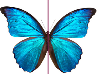
- Main focus of the image is within the center of the picture plane
- Is reliant on each side of the image being similar
- The eye tends to remain at the center
- Gets information across quickly
- When used in portraiture, it increases the intensity of the subject's gaze
- Used for maximum impact
- Directs eye to the most important area on the image
- Creates a direct and static composition
The Asymmetrical Composition:

- Any image that does not use symmetry
- Helps create a dynamic and vibrant composition
- Explored by Picasso and Braque in an attempt to reflect nature as e see it: in parts that eventually result in a visualized whole
Cropping:
- A way to zoom in or out of an image
- Creates focus and drama
- Not showing the whole image can stimulate an audience's imagination
- It can help intensity the part an audience can see
- Used extensively in comic-book art to depict a character's POV
- Played a major part in the development of early film language

Color within the image:
The job of an illustrator: to understand the shifting relationship between colors as they sit together on the picture plane
Guiding Principles:
Primary colors: red, yellow, and blue, and are indivisible
Secondary colors: the mixing of the primaries: green, orange, and violet.
Tertiary colors: the mixing of primary and secondary colors: red-orange, yellow-green, blue-violet, etc...
Key terms:
Hue: the intrinsic "color" of a color
Value: the "lightness" or "darkness" of a color
Tint: a lighter color than the pure hue
Shade: a darker color than the pure hue
Chroma: a combination of hue and saturation
High Chroma: a saturated color in its purest strength
Low Chroma: color in it's most muted, grayish form
Color Wheel: a systematic mixing guide, based on Newton's spectrum, with the primary colors plotted at equal distances around the wheel and the other colors filling in the gaps between
Complementary Colors: colors opposite each other on the color wheel
Color solid: a three-dimensional mixing chart that combines a color wheel, a chroma chart, and a value chart
Color scheme: the use of a restricted color palette
Monochromatic: a color scheme that only uses variations (in tone) of one hue
Perceptual Transparency: an illusion of transparency (or overlapping) created with flat, opaque colors, using two colors and their exact midway color
Simultaneous Contrast: the way that a particular color is changed by it's neighboring color, the most extreme example being two complementary colors that highlight their neighbor's hue